Video games provide the perfect environment for storytelling. Basic tenets of psychology tell us that people feel most engaged when given challenges to beat and cool images to look at, and games wrap these elements together in sonorous harmony. What most people don't realize is that behind every intriguing new game (or nostalgic, old-classic collecting dust in a game store somewhere) is a designer who spent hours deciding on the best way to monopolize your attention for a few hours.

This isn't the most accurate representation, but it's close enough.
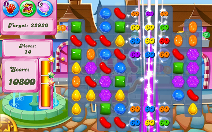
In order to best entertain a human, one must hack into the feelings of a human. Images are great at doing this quickly, but why? Spoiler alert: It's color. Carefully used, color can draw the eyes in or scare them away. Creative use of color allows game designers to attach meaning to the moving parts. When the lights on the screen dim and the path the player followed gets lost to the void, anxiety levels start to spike. A character in red clothing, no matter where on the screen they show up, encourages player interaction. Orange can inspire energy or exhaustion, depending on its saturation and undertones (from Designers Dictionary of Color, Sean Adams).
Video games have some key differences from literature in how they tell stories. Authors of books have complete control over the story, events, and the protagonist in every way except how the reader interprets them. Game designers typically allow players to have some power over the events in the story by giving them choices on how to move their character. Players are unpredictable, as are their emotions, so designers have to consider how the elements in a scene can influence player perception of the story. This is where color comes in. Suppose the player is about to enter an area with lots of creepy enemies ready to chase the protagonist. When the designer wants to instill a sense of urgency and an element of surprise, they can always alter the colors in the scene to let the player know that “hey, something dangerous is definitely hiding behind that rock. Or maybe that one.”
Video games have some key differences from literature in how they tell stories. Authors of books have complete control over the story, events, and the protagonist in every way except how the reader interprets them. Game designers typically allow players to have some power over the events in the story by giving them choices on how to move their character. Players are unpredictable, as are their emotions, so designers have to consider how the elements in a scene can influence player perception of the story. This is where color comes in. Suppose the player is about to enter an area with lots of creepy enemies ready to chase the protagonist. When the designer wants to instill a sense of urgency and an element of surprise, they can always alter the colors in the scene to let the player know that “hey, something dangerous is definitely hiding behind that rock. Or maybe that one.”
Storytelling with Color Palettes
|
The color palette of a video game is often the first thing you notice, marketing the game and telling its story before players ever hit the download button. Anger and sadness are typically conveyed in easy-to-recognize primary colors (red and blue), but what about more complex emotions like adventure or introspection? How does a game market itself as being a logical puzzle or a fast-paced thriller?
|
Sometimes, a game can be both in the worst way.
Color theory can be seen in level design. Games can introduce an element of mystery by lowering the saturation of the colors in a scene and utilizing lots of blue and grey. Maybe, as a player explores the mystery of world around them, they come across something unexpected. If it’s something supernatural, like a spaceship appearing in the sky, an appropriate choice would be a bright color against the blue or grey of the background. Bright lights against a neutral background promote feelings of suspense and anxiety; do these strange creatures come in peace? If something unexpected turns out to be something magical, that bright glow can also provoke wonder (rather than anxiety).
Oh look, a plot device!
Visuals in games can be very stimulating; it’s easy to load the player down with too many. Games like Inside choose to tell the story of the game in very few colors.
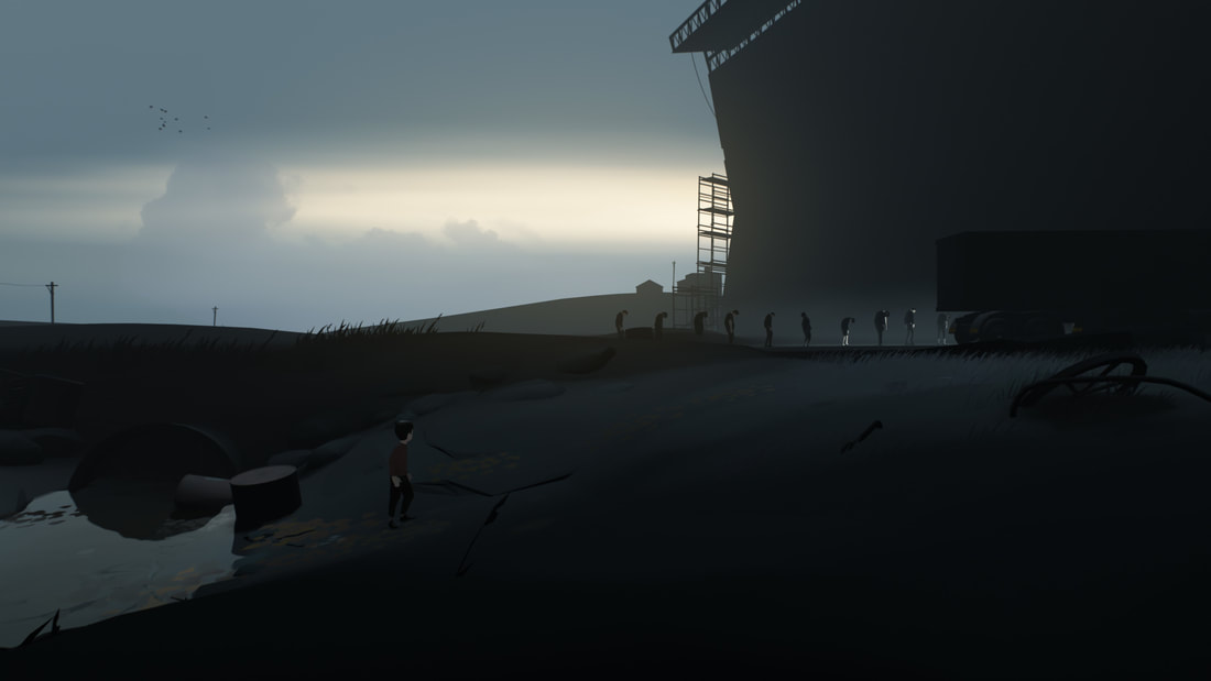
Every color in Inside is mixed with grey, and it gives the game a really ominous feel. Players spend the game trying not to be noticed by other characters and dodging the police. There is no dialogue in Inside, but the color palette speaks loudly about a lonely and desolate world in which humans are made to conform and then shipped away in trucks.
Grey is the dominant color throughout the entire game and white is used as a highlight. Highlighting with white allows characters to see details in the background, such as the people getting into the truck and the strange clouds on the horizon. The designers took a minimalistic approach when creating levels for this game; there are no bricks on the building and very few blades in the grass. None of the characters even have faces, because it just isn't necessary. Had the designers used more saturated colors in green or brown, important details like the people getting into the truck would be lost.
Choosing a minimalistic approach to a game's color palette can be risky. Traditionally, realism is achieved by rendering an object in its real world colors (or close to them). This is not a rule, however, because highlights and shadows in the color palette enable players to recognize that a box is a box, even without it being colored exactly like a real box.
When your friend drags you to a party.
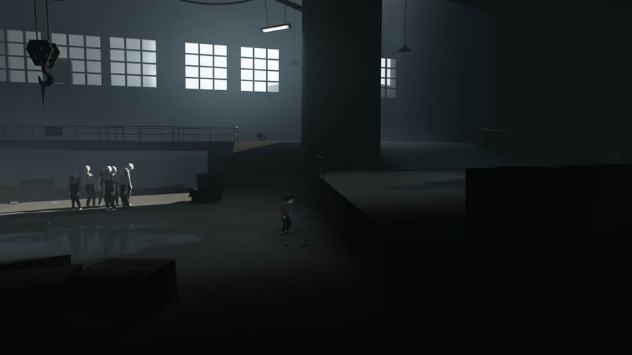
The interactive elements (the ledge and the boxes) in this scene are all rendered in the dominant grey color, and the people in the background are highlighted with white again. Surely game designers would want players to notice the objects that they can manipulate, so why make them blend in with the rest of the level? Players do need to understand which objects in a scene are movable, but if the background highlight is white and the boxes in the foreground are also white, then both risk losing their stylistic meaning.
There are lots of other atmospheric games that use color in creative ways without sticking to minimalism. The game Okami for instance, chooses to include many colors in its palette.
There are lots of other atmospheric games that use color in creative ways without sticking to minimalism. The game Okami for instance, chooses to include many colors in its palette.
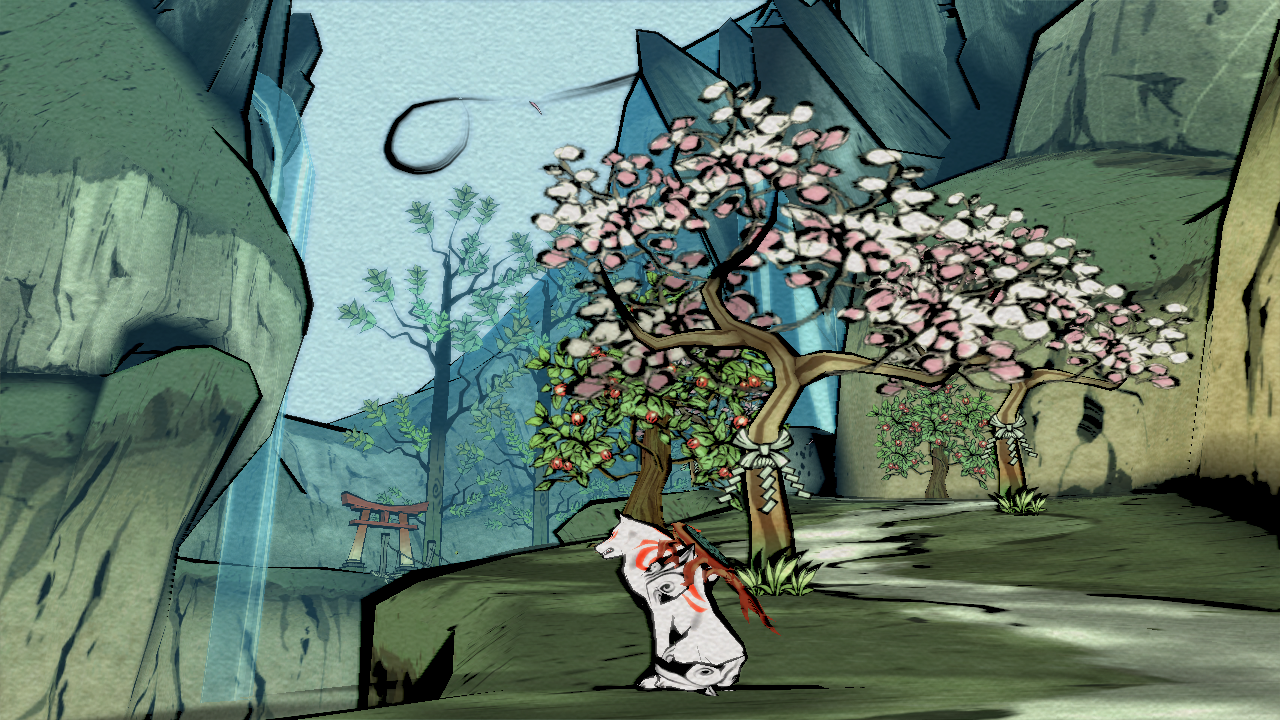
Okami pulls inspiration from Japanese mythology, and is designed to look like a wood-block painting. Okami uses lots of color to tell a story, but less in a practical way and more in a mesmerizing way.
|
|
When a player clears an area on the map of its "evil spirits," a cut scene is played, showing new life sweeping across the land. Neutral grey and brown colors transform into brilliant greens and pastels, rewarding players for their accomplishment.
Like Inside, Okami uses color thematically. While the color in Inside (or lack thereof) communicates the hopelessness of the environment to the player, Okami uses color to inspire feelings of wonder. The object of the game is to restore color back into the world by driving out all of the evil spirits (and monochromatic colors). |
Keep scrolling for a special surprise!

It's getting dark, are you scared?
Are you still there? What's that sound?
Boo!
Let's get spoopy!
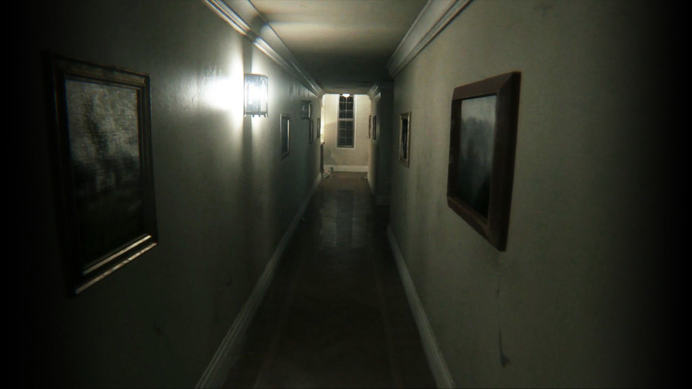
Horror games are fantastic at setting a mood with a color palette. The screenshot above is from Silent Hill: P.T., a short game with just a house, a ghost, and a radio.
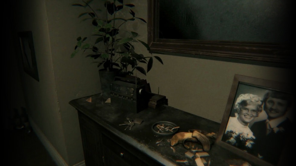
Think about what your eyes notice first in this image. For some, the eyes may start at the picture before following the mess on the desk until settling on the radio (an interactive object). Others may notice the saturated green of the plant, which is positioned just behind the radio. The radio is important, because it interacts with the player and delivers the narrative of the game. The brain realizes this importance from the radio's proximity in relation to the brighter colored items on the desk.
The dominant color in P.T. is brown, which is found in the floor, walls, and furniture. Highlighting is done with saturated colors; like the green leaves on the plant and the white in the photograph. Objects in this game are rendered in their real-world colors, which isn't uncommon for games in the horror genre. This is likely because over-stimulation, caused by having such a high level of detail in the game, contributes to the player's anxiety in a way that the designers count on.
Game designers in the horror genre are actually evil. Okay, maybe not evil, but they are trying to inspire fear in their players. Color palettes that creep people are out are a great way to trigger those feelings of suspense that make horror games so appealing. This technique can also be used in a game's branding.
Sorry boss, I'm going to be late for work. I've got to wipe all of the Stephen King off my car.
Click above me 3 times.
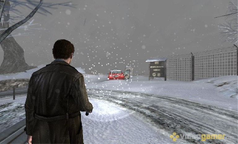
The image above comes from Silent Hill: Shattered Memories, instantly recognizable for its realistic, yet muted color palette.
Part of the branding for the Silent Hill series comes from using color in this way in every game. The details are skillfully woven in, and the map feels like places the player could see anywhere. In fact, if it weren't for that the environment is usually dark, Silent Hill wouldn't feel super different from games like
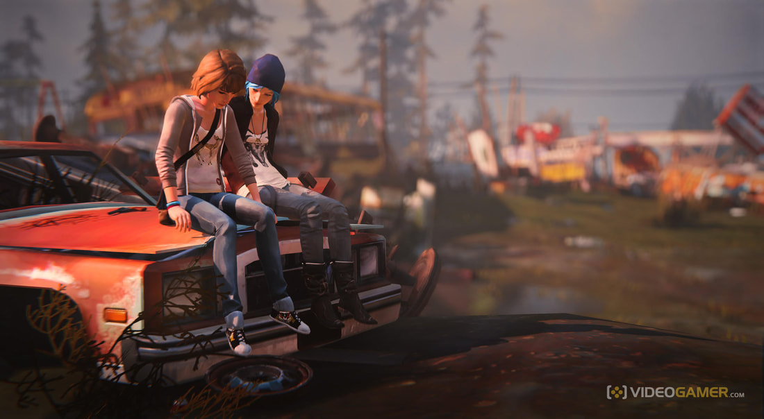
Life is Strange, which takes place mostly during the daytime.
Part of the branding for the Silent Hill series comes from using color in this way in every game. The details are skillfully woven in, and the map feels like places the player could see anywhere. In fact, if it weren't for that the environment is usually dark, Silent Hill wouldn't feel super different from games like
Life is Strange, which takes place mostly during the daytime.
Lighting turns scary junk into just regular junk.
Life is Strange is a newer title that also uses suspense as a mechanic, but isn't branded as a horror game. Like Silent Hill, Life is Strange uses realistic colors and a high level of detail. It's easy for players to drop themselves into either of these games and engage with the events happening around them. Palettes that have a wide range of color can be just as useful for telling a story as a minimalistic game with fewer colors.
